On the configuration page of a form, dynamic fields are grouped under four menus named Basic, Advanced, Layout and Data. Each component can be dragged to the right to build the desired form. The configuration menu of each component opens when it is dropped.
Basic
The Basic category of dynamic fields contains the components Text field, Text area, Number, Checkbox, Checkbox group, Dropdown menu and Radio.
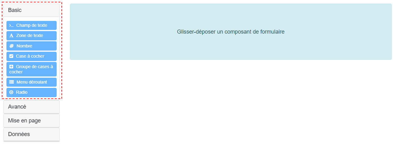
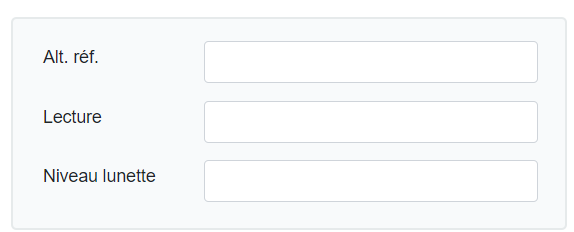
A Text field is used to enter a string (a sentence or several words) on a single line.
Example:
Configuration window:
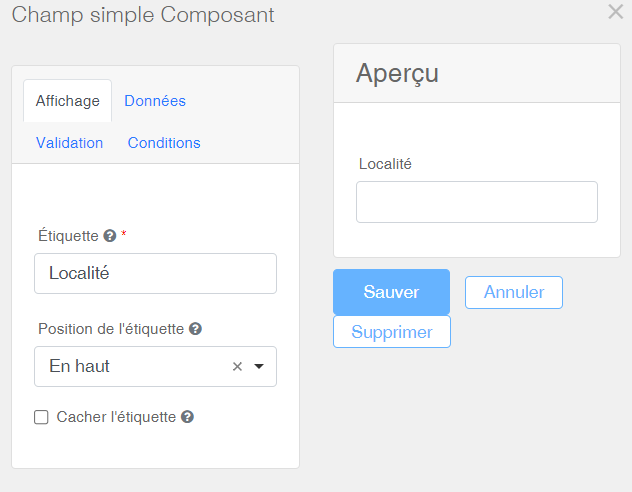
| Label | The field name is entered under Label. |
| Label position | The label position can vary. |
| Hide label | The label can be hidden if needed. |
| Final rendering | The final rendering appears on the right, in the Preview window. |
Text area
A Text area is used to enter descriptive sentences or texts on several lines.
Example:

Configuration window:
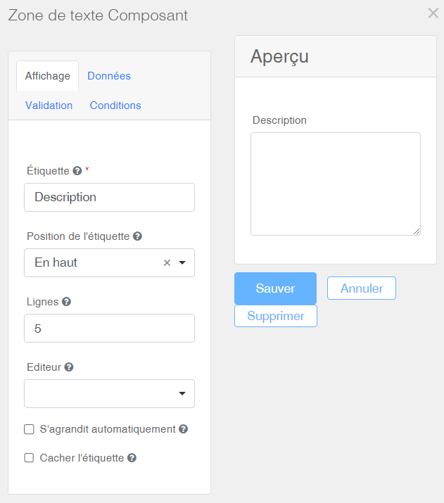
| Label | The field name is entered under Label. |
| Label position | The label position can vary. |
| Lines | The number of lines defines the height of the text area. |
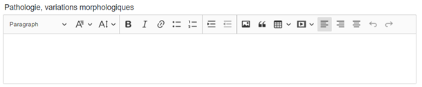
| Editor |
A more complete text editor, with a toolbar, can be enabled by selecting the value CKEditor in the Editor dropdown menu. Here's a preview with such a toolbar.
|
| Auto-resize | The height of the text area within the form expands proportionally to the entered text. |
| Hide label | The label can be hidden if needed. |
| Final rendering | The final rendering appears on the right, in the Preview window. |
Number
The Number field forces the user to enter only numeric values. It maintains database consistency by avoiding the mix of letters and numbers in the same field. This enhances the potential for future analytical/statistical use.
Example:

Configuration window:
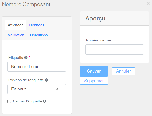
| Label | The field name is entered under Label. |
| Label position | The label position can vary. |
| Hide label | The label can be hidden if needed. |
| Final rendering | The final rendering appears on the right, in the Preview window. |
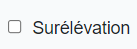
The Checkbox field adds a single checkbox to the form.
Example:
Configuration window:
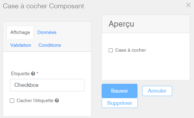
| Label | The field name is entered under Label. |
| Hide label | The label can be hidden if needed. |
| Final rendering | The final rendering appears on the right, in the Preview window. |
A Checkbox group allows grouping several checkboxes. The user can select multiple checkboxes within a group. This contrasts with Radio buttons which are mutually exclusive and only allow one selection within a group.
Example:

Configuration window:
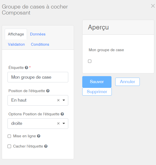
| Label | The group name is entered under Label. |
| Label position | The label position can vary. |
| Label position options | Allows completing the label position. |
| Inline display | Displays checkboxes horizontally. |
| Hide label | The label can be hidden if needed. |
| Final rendering | The final rendering appears on the right, in the Preview window. |
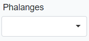
A Dropdown menu allows the user to choose one or more values from a predefined list.
Example:
Configuration window:
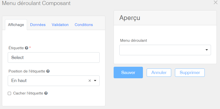
| Label | The field name is entered under Label. |
| Label position | The label position can vary. |
| Hide label | The label can be hidden if needed. |
| Final rendering | The final rendering appears on the right, in the Preview window. |
The Data tab is used to configure the dropdown menu:
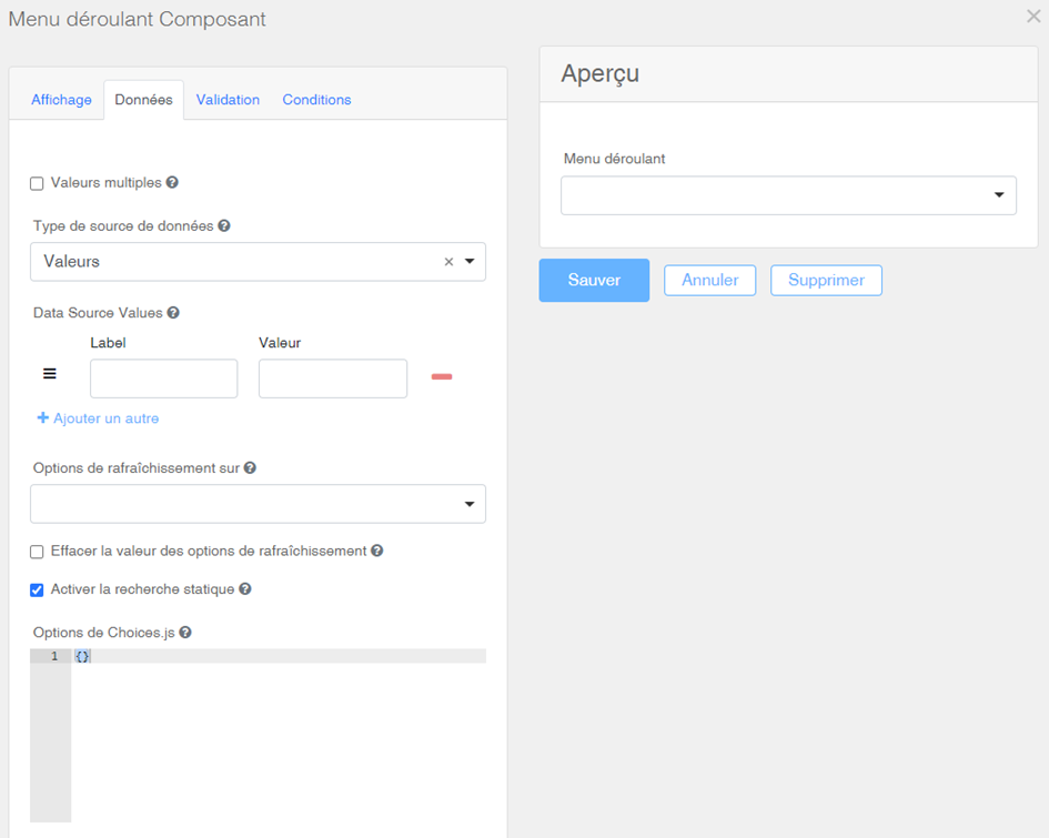
| Multiple values | Allows the user to select multiple predefined values. |
| Data source type | By default, leave it set to Values. |
| Data Source Values |
In the Label column, enter the name of the items to be displayed in the dropdown. Additional rows can be added by clicking on Do not enter anything in the Value column; the required database encoding is generated automatically. Do not modify it to avoid losing previously inserted data. |
| Enable search |
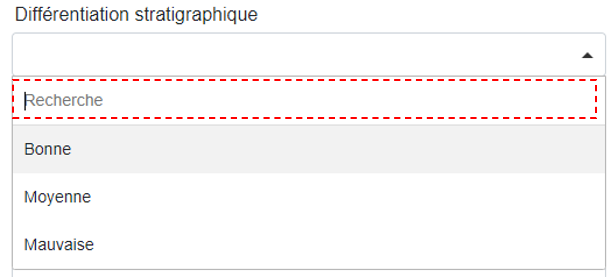
The static search option facilitates finding elements within a dropdown that contains many items. Here's an example:
|
| Choices.js option |
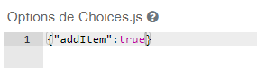
Adding unlisted data: When importing data from an xlsx file, values not present in the dropdown list can be added automatically if the component has been edited beforehand. To do this, enter the following code: {"addItem" : true}
The import tool will then display a new option in its column-matching page titled No match, import the value written in this file. |
| Final rendering | The final rendering appears on the right, in the Preview window. |
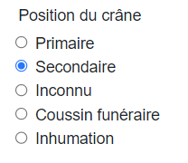
Unlike checkboxes, Radio buttons force the user to select only one option within a group. They are used for mutually exclusive selections.
Example:
Configuration window:
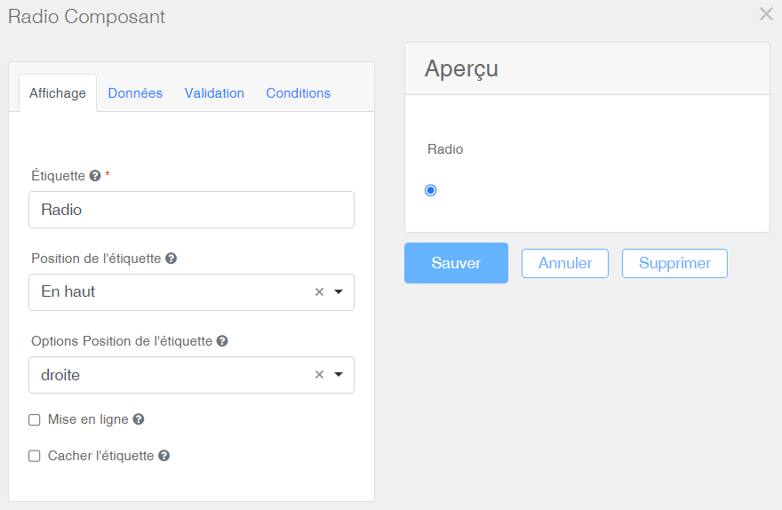
| Label | The Radio button name is entered under Label. |
| Label position | The label position can vary. |
| Label position options | Allows customizing the label position. |
| Inline display | Displays the Radio buttons horizontally. |
| Hide label | The label can be hidden if needed. |
| Final rendering | The final rendering appears on the right, in the Preview window. |
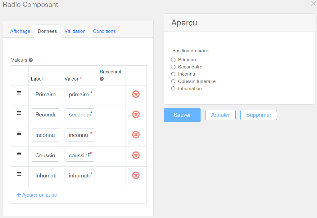
The Data tab is used to generate multiple radio buttons:
| Values |
In the Label column, enter the name of the Radio buttons. Additional rows can be added by clicking on Do not enter anything in the Value column; the necessary coding for the database is generated automatically. Do not modify it to avoid losing previously entered data. |
| Final rendering | The final rendering appears on the right, in the Preview window. |
Advanced
The Advanced category of dynamic fields contains the Date / Time component.
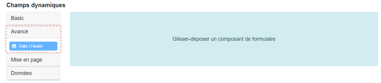
The Date/Time field is used to input a date and/or time. Dropdown menus ensure consistency in data entry.
Example:

Configuration window:
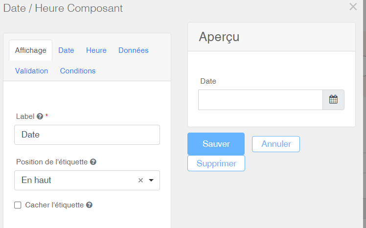
| Label | The name of the field. |
| Label position | The position of the label may vary. |
| Hide label | The label can be hidden if needed. |
| Final rendering | The final rendering appears on the right, in the Preview window. |
The Date tab is used to define settings related to date display.
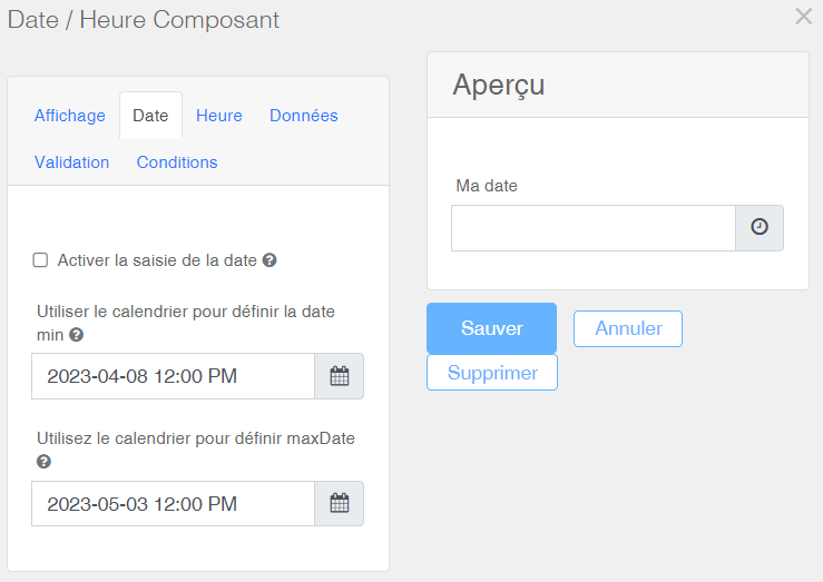
| Enable date entry | The Enable date entry option is enabled by default; if the box is unchecked, only the time can be entered in the field. |
|
Use calendar to set min date Use calendar to set max date |
The date range restricts the range of dates presented to the user in the calendar dropdown menu. |
| Final rendering | The final rendering appears on the right, in the Preview window. |
The Time tab displays settings related to time display.
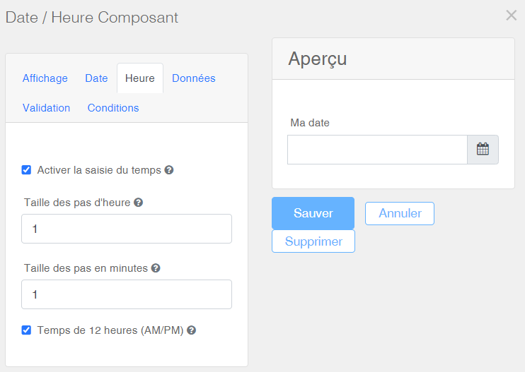
| Enable time entry | The Enable time entry option is enabled by default; if the box is unchecked, only the date can be entered in the field. |
|
Hour step size Minute step size |
Time selectors can have step sizes defined in hours or minutes. |
| 12-hour format (AM/PM) | Time display can be switched between 12-hour or 24-hour formats. |
| Final rendering | The final rendering appears on the right, in the Preview window. |
In conclusion, the field may contain the date, the time, or both, if the options Enable date entry and Enable time entry are selected simultaneously.
Layout
The Layout category of dynamic fields contains the components HTML Element, Columns, Field Set, Panel and Tabs.
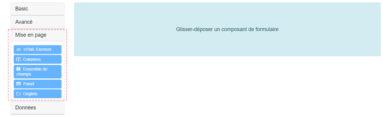
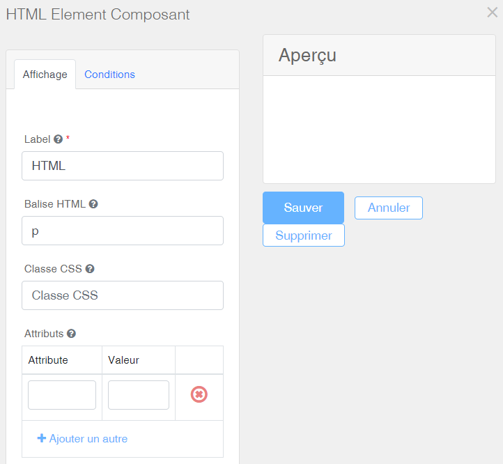
An HTML component is used to insert explanatory text or images within the form.
Configuration window:
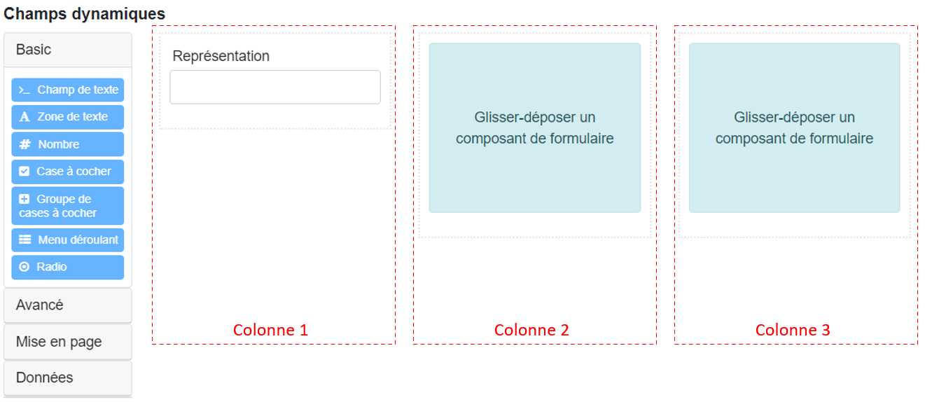
Adding a field by default spans the full width of the page. The Columns component allows dividing the page into equally wide cells, enabling insertion of different types of fields within them. The columns are marked in red below.
Example:

The dynamic field configuration interface allows you to first define columns, then drag fields into them. In the example below, a Text field named Representation has been placed in the first column.
Configuration window:
The Columns component displays a table under Column properties where each row represents a column. The default page width is twelve units. Consequently:
- For one column, set a single column with a Width of 12 units.
- For two columns, set two columns each with a Width of 6 units.
- For three columns, set three columns each with a Width of 4 units.
- And so on.
The total Width values must always equal 12 units. The following example divides the page into three columns of 4 units each.
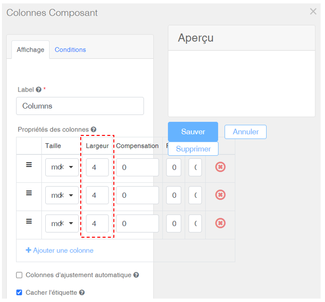
| Label | The name of the field. |
| Column properties |
Only fill the Width column and leave other values at default. Additional columns can be added by clicking on It is important that the sum of all Width values equals 12 units. |
| Auto-adjust columns | Automatically adjusts column widths based on nested elements. Leave this option disabled. |
| Hide label | The Label of the columns can be hidden, which is typically the case, since inserted components already have a label. |
Field Set
A Field Set allows grouping multiple fields within the same frame. Typically, this component includes, for each row, a Columns component enabling assignment of other components to each cell. The following example shows a Field Set named Burial Mode:
Example:
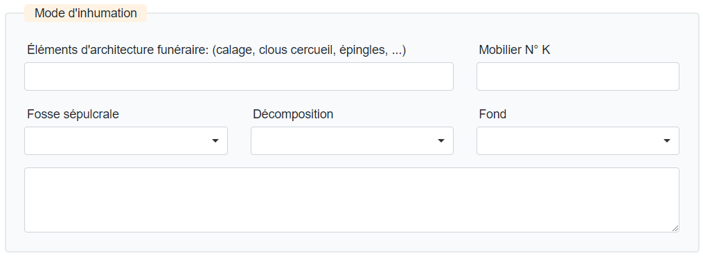
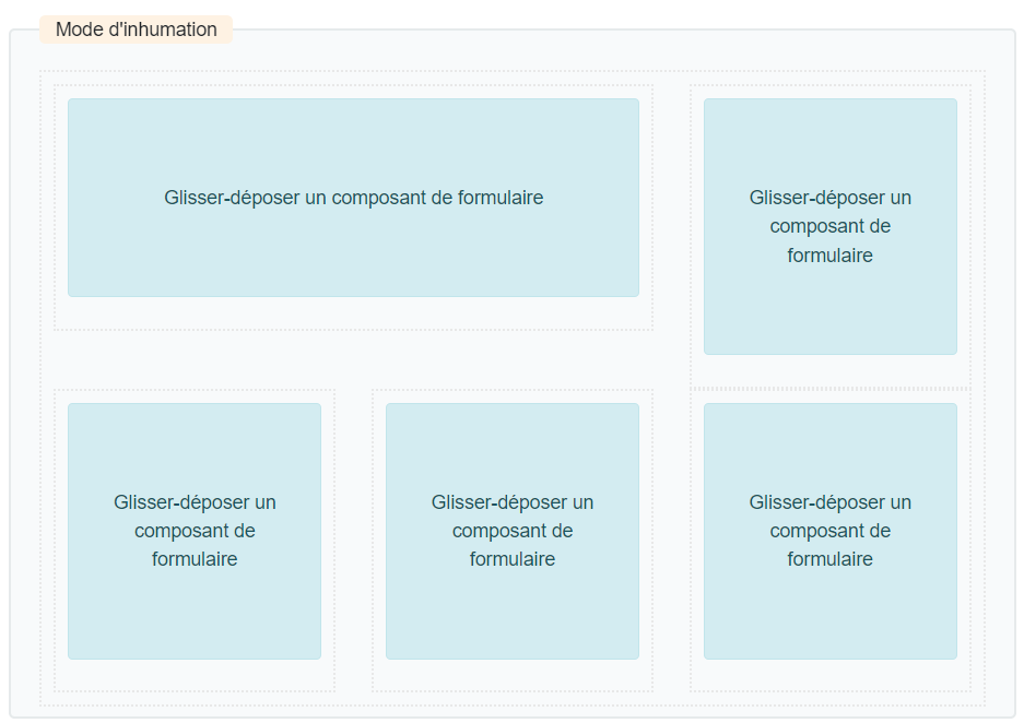
Its first row consists of two columns, 8 and 4 units wide. The second row consists of three columns, each 4 units wide. Specific components are then dragged into the resulting cells.
Configuration window:
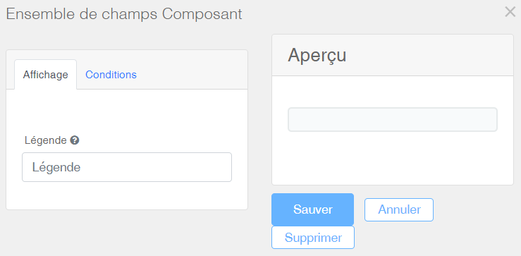
| Legend | The name of the Field Set. |
| Final rendering | The final rendering appears on the right, in the Preview window. |
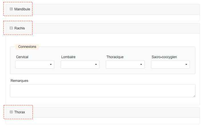
A Panel works similarly to a Field Set as it groups fields within a frame. The difference lies in its aesthetics and the fact that it can be collapsed or expanded on screen by the user. The following example displays three Panels named Mandible, Spine, and Thorax:
Example:
Configuration window:
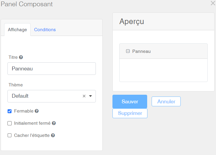
| Title | The name of the Panel. |
| Theme | Different styles are available. |
| Collapsible | The user can collapse the Panel if desired. |
| Initially collapsed | The Panel is initially collapsed when the form is viewed. |
| Hide label | The label or name of the Panel can be hidden. |
| Final rendering | The final rendering appears on the right, in the Preview window. |
Tabs
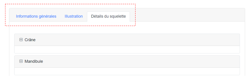
Tabs help organize complex forms in a more user-friendly way.
Example:
Configuration window:
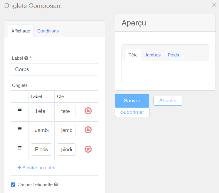
| Label | The name of the Tab. |
| Tabs |
In the Label column, enter the names of the Tabs. Additional Tabs can be added by clicking Do not enter anything in the Key column; the necessary database encoding is generated automatically. Do not modify it to avoid losing already inserted data. |
| Hide label | The Label of the Tabs can be hidden, which is generally not the case. |
| Final rendering | The final rendering appears on the right, in the Preview window. |
Data
The Data category of dynamic fields includes the components Data Grid and Container.
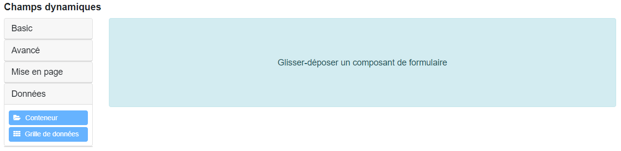
Data Grid
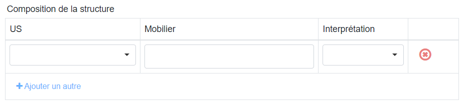
A Data Grid is used to enter structured information of the same type, repeated across several successive rows. The  button adds a new row to the form. In the example below, the structure might consist of several stratigraphic units (US), with new rows added by simply clicking the button.
Example:
Configuration window:
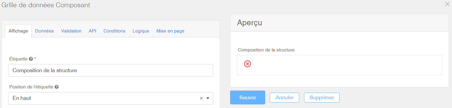
- Enter the name of the Data Grid in the Label field, then click Save.
Once the Data Grid is created, components can be dragged into it.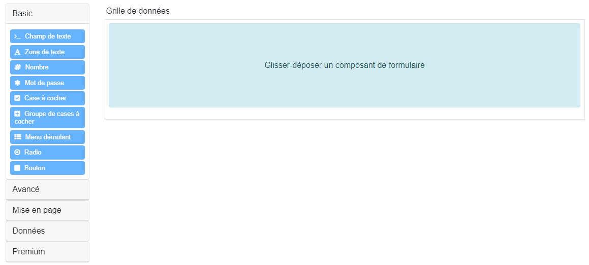
In this example, Dropdown and Text field components have been inserted inside the grid.

- Then click Save.
Container
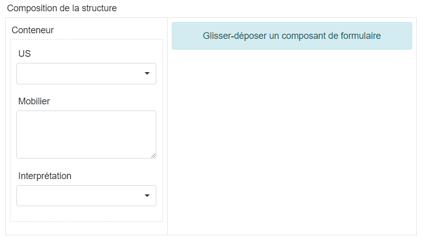
By default, a Data Grid arranges inserted fields horizontally. A Container offers the ability to stack fields vertically instead.
Example:
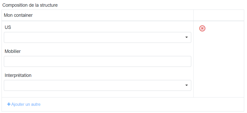
Configuration window:
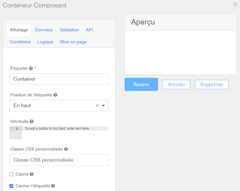
- Do not name the Container; keep the default configuration, which hides its label.
Once the Container is created, components can be dragged into it.
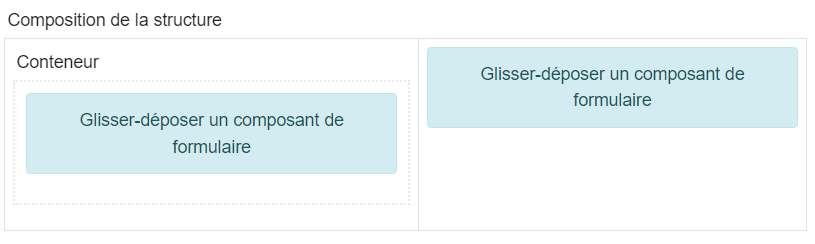
The components will then be displayed vertically:
Relation shortcut
The Relation shortcut field allows the user to manage the relations of a record — normally handled in the relation panel — directly within the form. Each Relation shortcut is linked to a subtype of the organisation (for example Stratigraphic unit) or to a media type (Photo, Drawing or File), and displays the related records in a searchable dropdown menu with multiple selection.
The field stores no data of its own: it is purely a shortcut to the relation panel. Selecting a record in the field immediately adds the corresponding row to the relation panel; removing it from the field removes the row. Conversely, relations added or deleted directly in the relation panel are automatically reflected in the field. As with the relation panel, the relations are only saved to the database when the record itself is saved.
Configuration window:
| Label | The field name is entered under Label. |
| Hide label | The label can be hidden if needed. |
| Description | An optional help text displayed under the field. |
| Final rendering | The final rendering appears on the right, in the Preview window. |
The Data tab is used to select the subtype linked to the field:
| Linked subtype | The subtype mirrored by the field in the relation panel. The dropdown menu offers all the subtypes of the organisation, as well as the media types Photo, Drawing and File. Each Relation shortcut field manages a single subtype; to manage the relations of several subtypes from the same form, insert one field per subtype. |
| Final rendering | The final rendering appears on the right, in the Preview window. |
When the record is saved, ArcheoBase checks the consistency between the field and the relation panel. If a relation has been removed in one place but is still present in the other, a confirmation message asks the user how to proceed.
Please note that the Relation shortcut component cannot be inserted inside a Data Grid, and only works on forms displayed together with the relation panel (the record detail page).
Component Modifications
The menu of each component appears when hovering over its top-right corner.
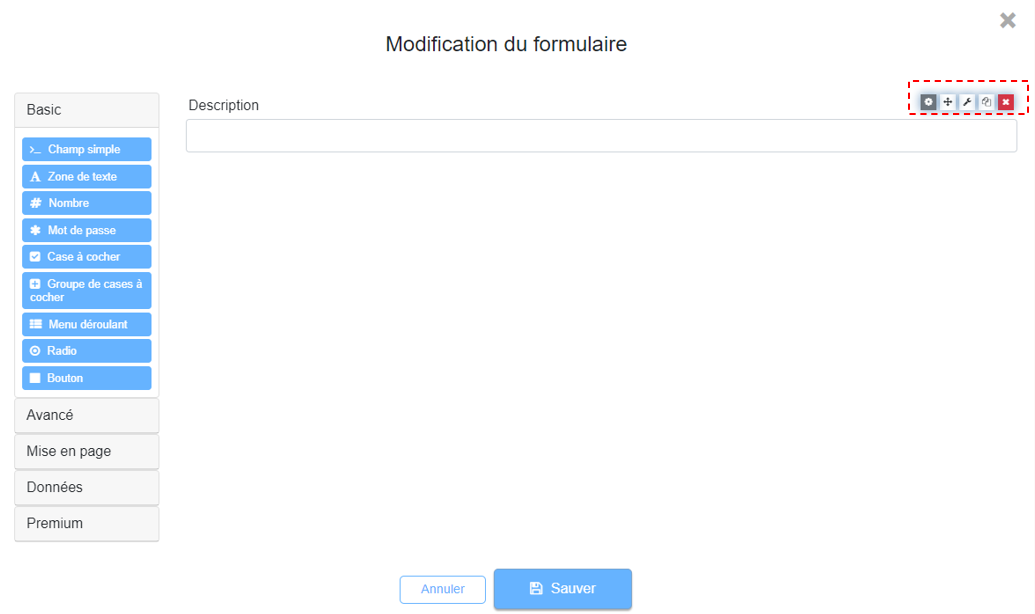
Main options available in this menu:
 |
Edit | Access the configuration window of the component. |
 |
Move | Move a component within the form. Click and hold the left mouse button to drag and insert it at the desired position. |
 |
Edit JSON | The Edit JSON button is not intended for end users and will be removed. |
 |
Copy | Useful when designing complex or repetitive forms. This feature allows you to duplicate sets of fields and then modify their labels as needed. |
 |
Delete | Delete the component from the form. |